ShopDreamUp AI ArtDreamUp

Deviation Actions


Suggested Deviants


Suggested Collections


You Might Like…


Description
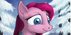
I believe you put Pinkamena in any dark place and she going to look extremely creepily with them big old eyes. That’s the effect i was going with this has a slight Tim Burton feel because of the limited colour pallete. ")
This looks a lot rougher then the other cards I have done because well you know…. pinkie loses her mind near the end and the style is a sort of metaphor.
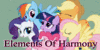
MLP title cards because why not the creative team behind the show deserves it.
I want to make one for every episode with its own quirky style that best suits that particular episode its very ambitious as I want to get it done before heaths warming eve if its possible lol. With the other jobs and shenanigans I doing out side of this it could be longer but wish me luck Bronies I hope to do our fandom proud. (Wink)")
I managed to find a font that’s close too the shows one for the credits so it should look not so basic now and fit in to the shows style better I may buy the actual font later on to be spot on.
I enjoy experimenting with the type design as much as the illustrations going to try and be a bit more adventurous as I am not sticking to one style of title cards now. (Smile)")
Until next deviation LATERS
All drawn on Photoshop CS6 with my Wacom tablet 5
is this Cute Win
Win  Fail
Fail 
This looks a lot rougher then the other cards I have done because well you know…. pinkie loses her mind near the end and the style is a sort of metaphor.
MLP title cards because why not the creative team behind the show deserves it.
I want to make one for every episode with its own quirky style that best suits that particular episode its very ambitious as I want to get it done before heaths warming eve if its possible lol. With the other jobs and shenanigans I doing out side of this it could be longer but wish me luck Bronies I hope to do our fandom proud.
I managed to find a font that’s close too the shows one for the credits so it should look not so basic now and fit in to the shows style better I may buy the actual font later on to be spot on.
I enjoy experimenting with the type design as much as the illustrations going to try and be a bit more adventurous as I am not sticking to one style of title cards now.
Until next deviation LATERS
All drawn on Photoshop CS6 with my Wacom tablet 5
is this Cute
Image size
3508x2480px 2.46 MB
© 2012 - 2024 JowyB
Comments136
Join the community to add your comment. Already a deviant? Log In
oh man, do not piss the witch off!